Data Storytelling
by
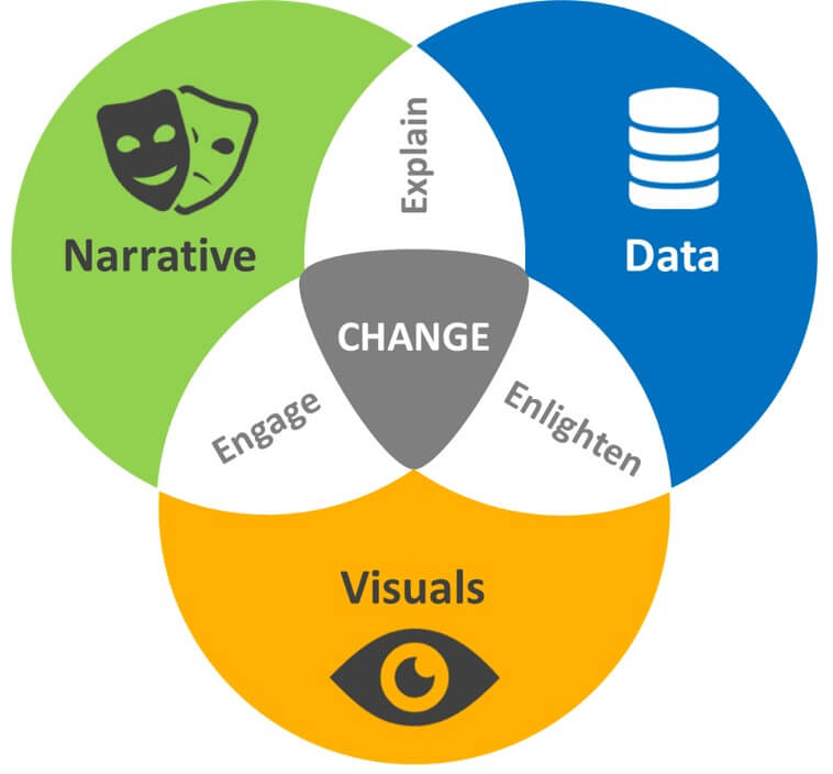
Story telling with data is how to communicate effectively with data using data visualization. In most cases, organizations recognize that being a successful, data-driven company requires skilled developers and analysts. Data is always remembered only when presented in the right way; slides, spreadsheet or graphs may not be the right way but a story is always the right way.
Story Telling Entails:
- Understanding the importance of context and audience.
- Determine the appropriate type of graph to use in your situation.
- Direct your audience to the most important part of your data.
- Think like a designer and utilize concepts of design in data visualization.
Why Data Storytelling?
Today’s digital workplace requires data fluency. Interpreting and presenting large amounts of data requires story telling skills. Story tellers must go deeper and wider to unearth the powerful story hidden within their data visualization skills. Stories, particularly those that are meaningful, are an effective way to convey data. Using maps is also another efficient way of telling a story. The visualization provides more content for those interested in diving deeper into the data.
Ways to Improve Data Storytelling:
- Focus on the Audience. Understand your audience and the level of management they are in the company. This will help you focus on the type of language to use and also the way to present your visualization skills. For example, what and how you report on a project’s completion will differ whether you are sharing with an operational staff or managers, executive decision-makers or whether you are asking for more investment to continue
- The structure of your story. This is very important since you need to plan on your introduction, middle and conclusion, this will allow your audience follow your presentation. Instead of thinking of the data first, you need to focus on the narrative first and then bring in the right data to illustrate and support the narrative.
- Make story memorable. Stories are always remembered more than facts. When we are able to turn the data into a story, this not only makes the numbers and facts digestible and understandable, but it gives them context, and makes what they stand for far more memorable.
- Use the correct language. The language of the particular business makes the story accessible, credible and it improves the connection with the audience.
- Makes the story real. Interesting stories involve characters—people who take actions and have experiences. They bring the story to life, they do things and show behaviors that are relevant. The audience often identify with a character and imagine themselves in the story.
- A good data visualization does a few things. It stands on its own; if taken out of context, the reader should still be able to understand what a chart is saying because the visualization tells the story. It should also be easy to understand. And while too much interaction can distract, the visualization should incorporate some layered data so the curious can explore.
Matthew Kemoi.
Pathways International.