

Dashboards People Actually Use: BI Design Principles
Most dashboards are opened once and abandoned. The difference between shelfware and a daily habit is design that starts from decisions, not data.
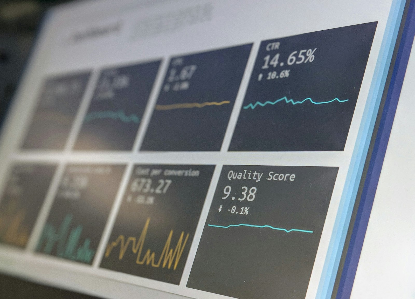
Ask any BI team how many dashboards they maintain and you will get a large number. Ask how many are opened weekly and the number collapses. The gap is rarely a technology problem — it is a design problem, and it starts with building dashboards from the data that exists rather than the decisions people make.
Start From a Decision
Every effective dashboard answers a question someone asks on a rhythm: should we intervene in this branch? Is the campaign paying back? Which queue needs staff today? Name the decision, the decision maker, and the cadence before designing anything. If no decision depends on a chart, the chart is decoration.
One Number, One Meaning
Adoption dies the first time two dashboards disagree. A governed semantic layer — where 'active customer' and 'net revenue' are defined once — is invisible to users but is the single biggest driver of trust. It is also the least glamorous line in the budget, which is why it is so often cut, and why so many dashboard estates quietly fail.
The remaining principles — progressive detail, sensible defaults, and ruthless retirement of unused reports — all serve the same goal: a dashboard that costs less attention than the decision it supports.